
Specters
Specters Coffee had a good product and a brand that wasn't keeping up with it. Nothing about the visual identity communicated why this coffee was worth more than what sat next to it on the shelf. The repositioning moved from craft aesthetics to performance.
- ClientSpecters Coffee
- IndustryFood & Beverage
- Timeframe2025
- RoleFull engagement





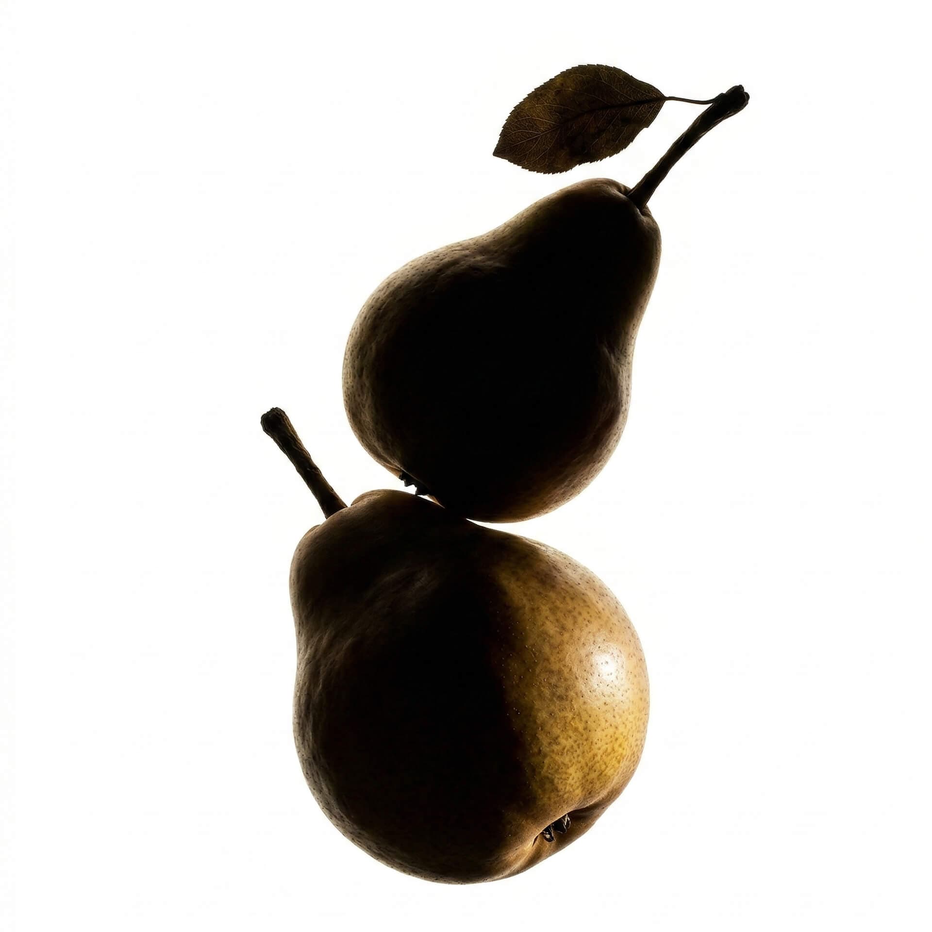
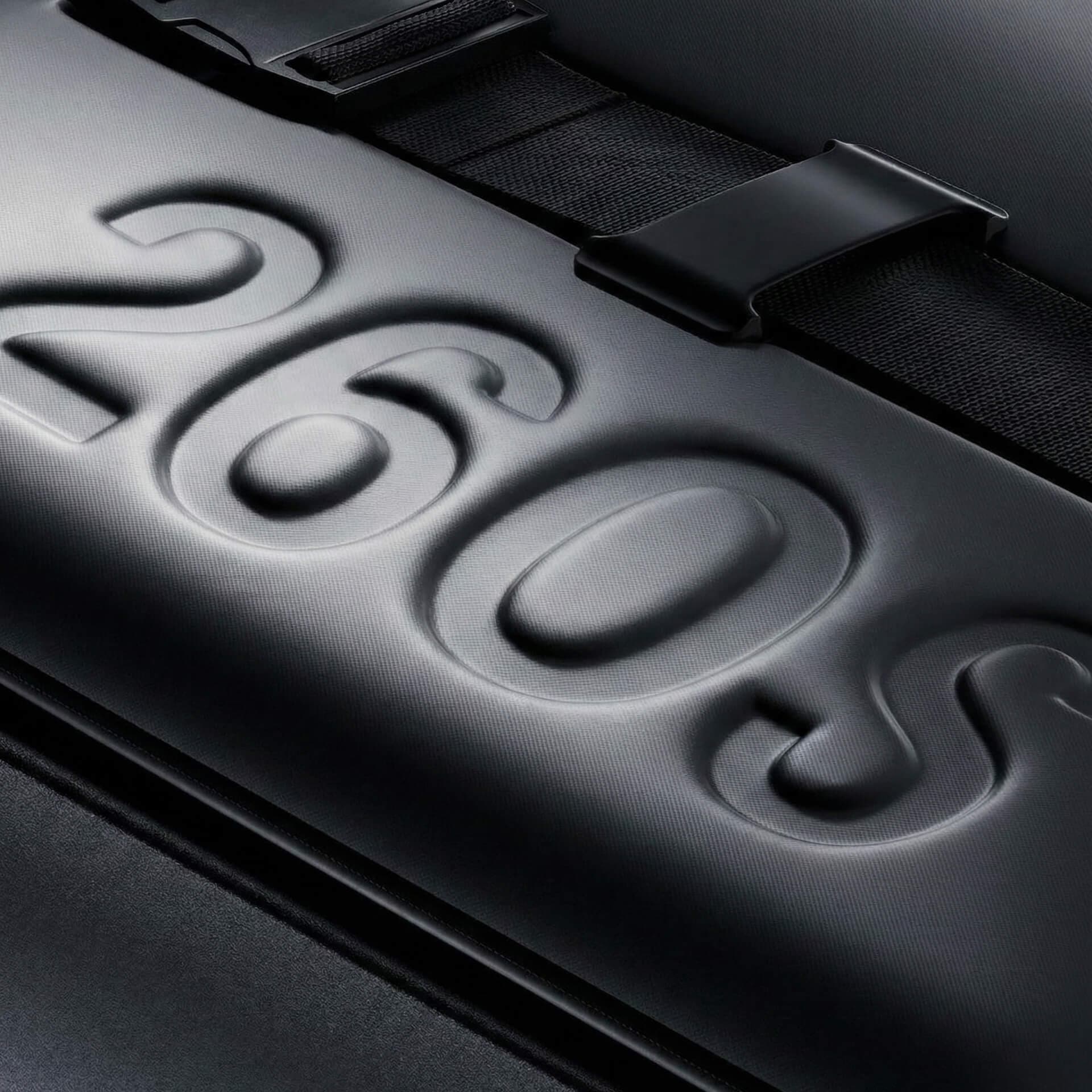
Coffee branding often starts with brown bags and stories about craft. Specters speaks to people who want to get a lot out of their day. We started with their working lives and ambitions, so the coffee would feel like a natural part of that routine.


Bold lettering and clear packaging give Specters a distinct presence among other coffee brands. The design feels at home on a desk, alongside the things you use to get work done. Before you read a word, the pack tells you something about who the coffee is for.

The coffee was good, but the old identity gave people little reason to choose Specters. The new brand makes that choice more personal, reflecting the ambitions and daily routines of the people who drink it. It gives the product a story that reaches beyond price.
More work

Method · Method

House of Founders · House of Founders