Method
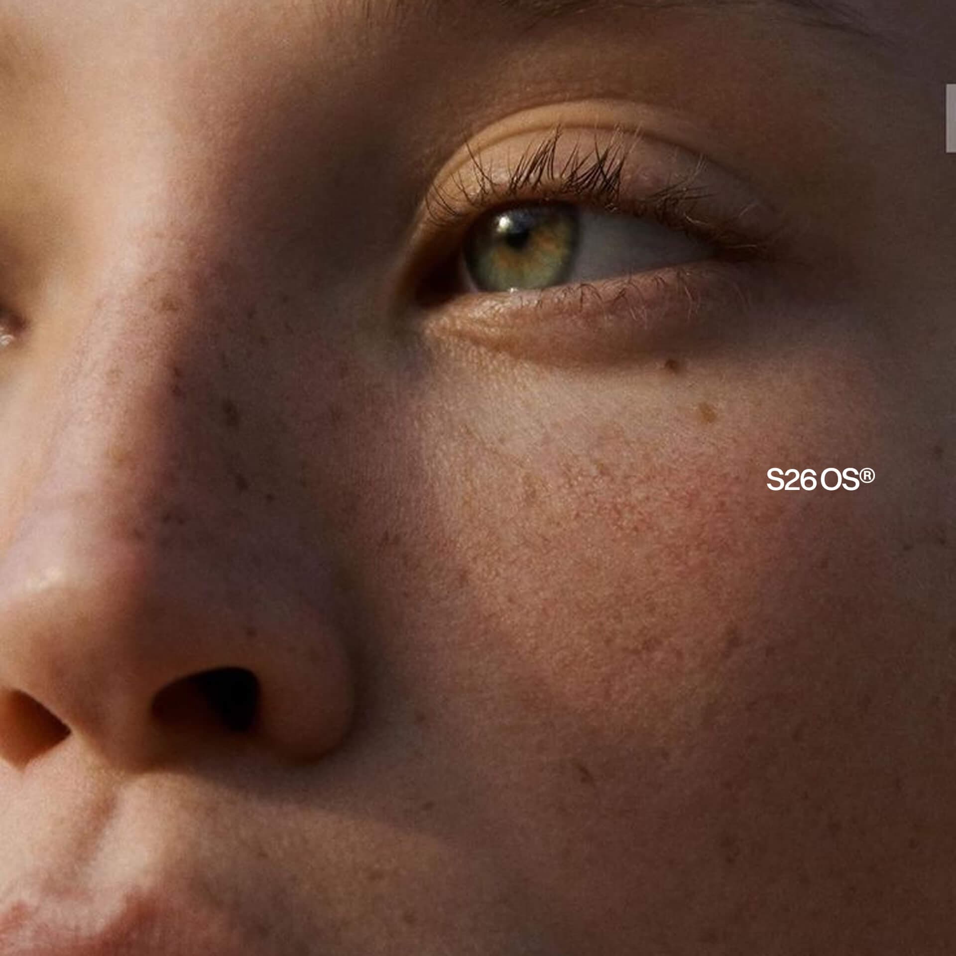
Method is an independent skincare brand concept built around a sense of calm. We wanted to explore how much a brand can say through its lettering, colours and the way everything sits on the packaging.
- ClientMethod
- IndustrySkincare & Personal Care
- Timeframe2025
- RoleFull engagement

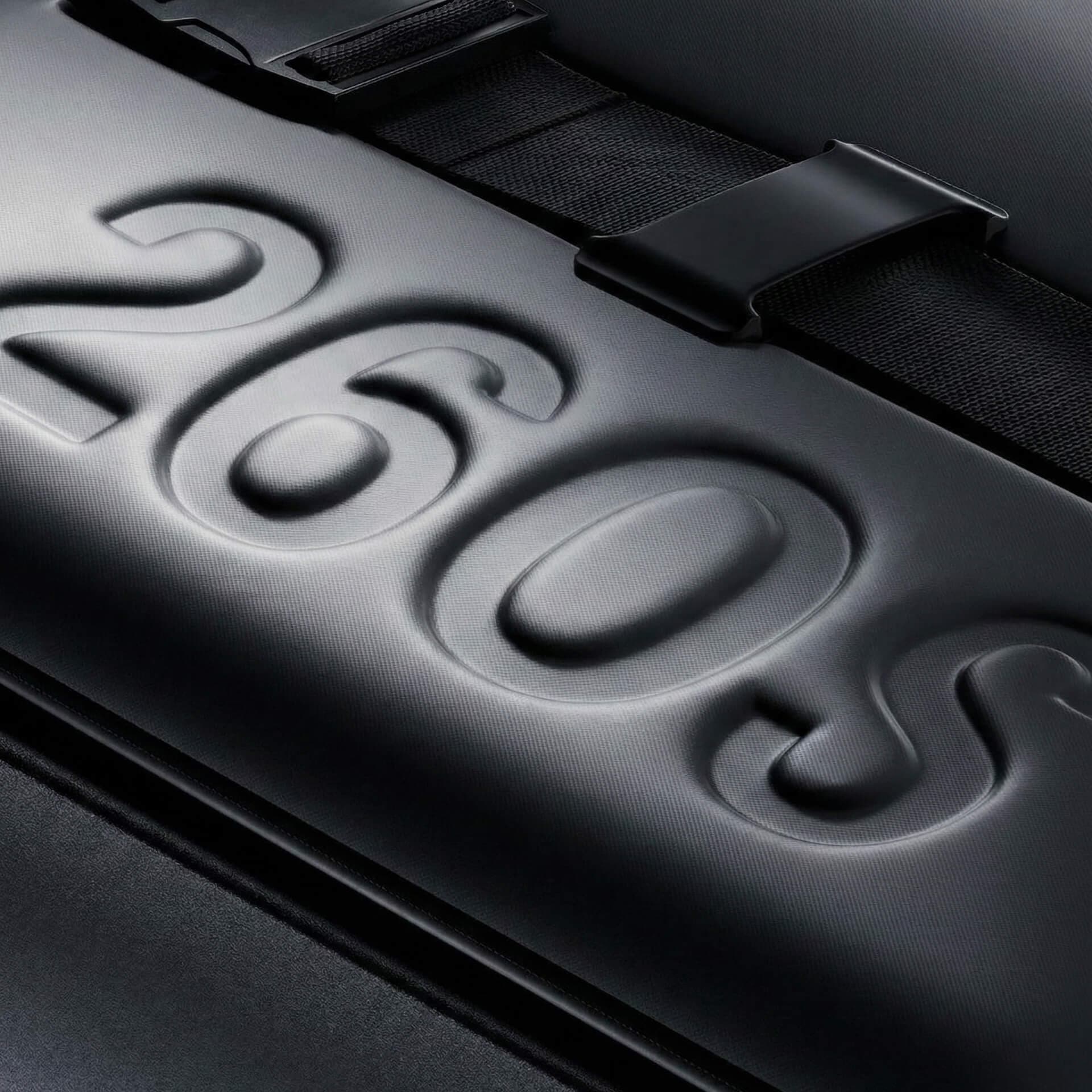

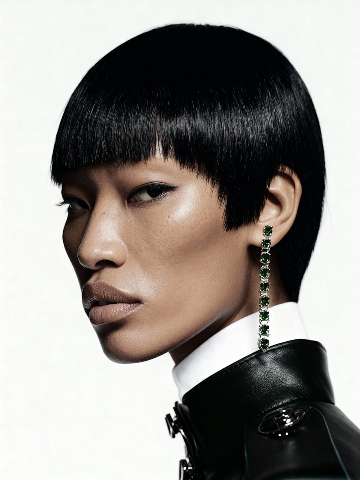

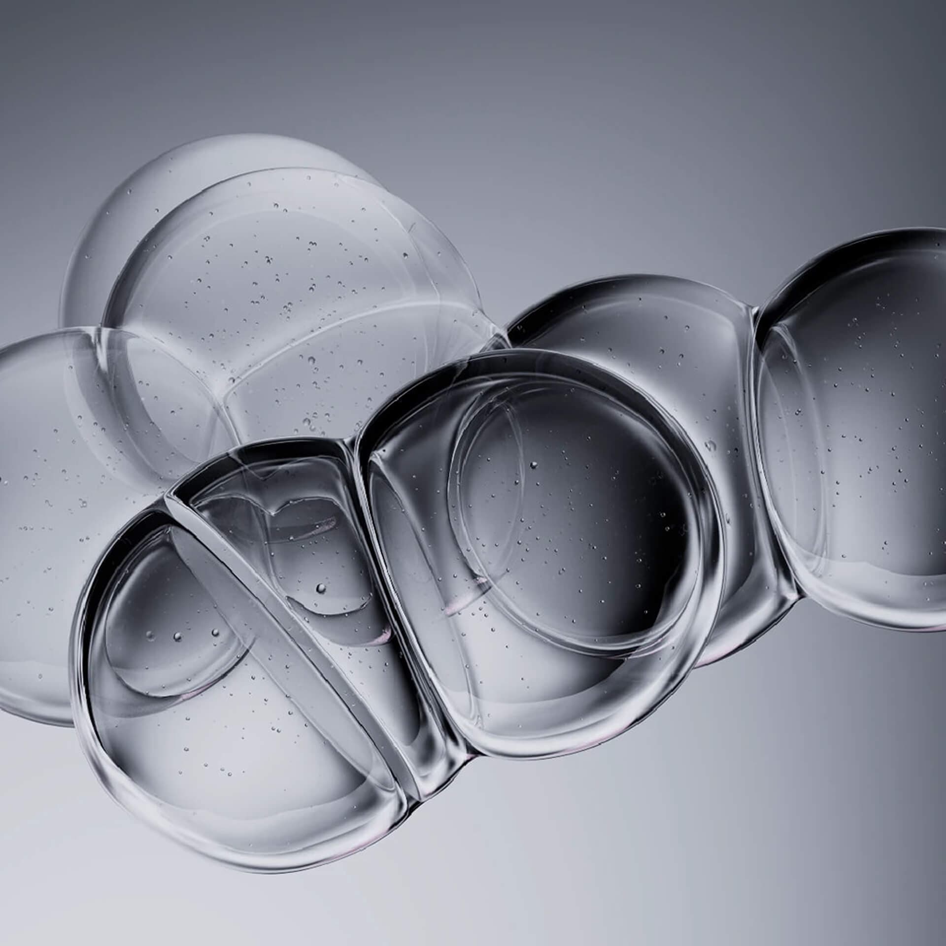
Method explores the calm you feel when every detail falls into place. We let lettering, colour and space carry the identity without relying on big promises or atmospheric photographs. Your attention stays with the product itself.

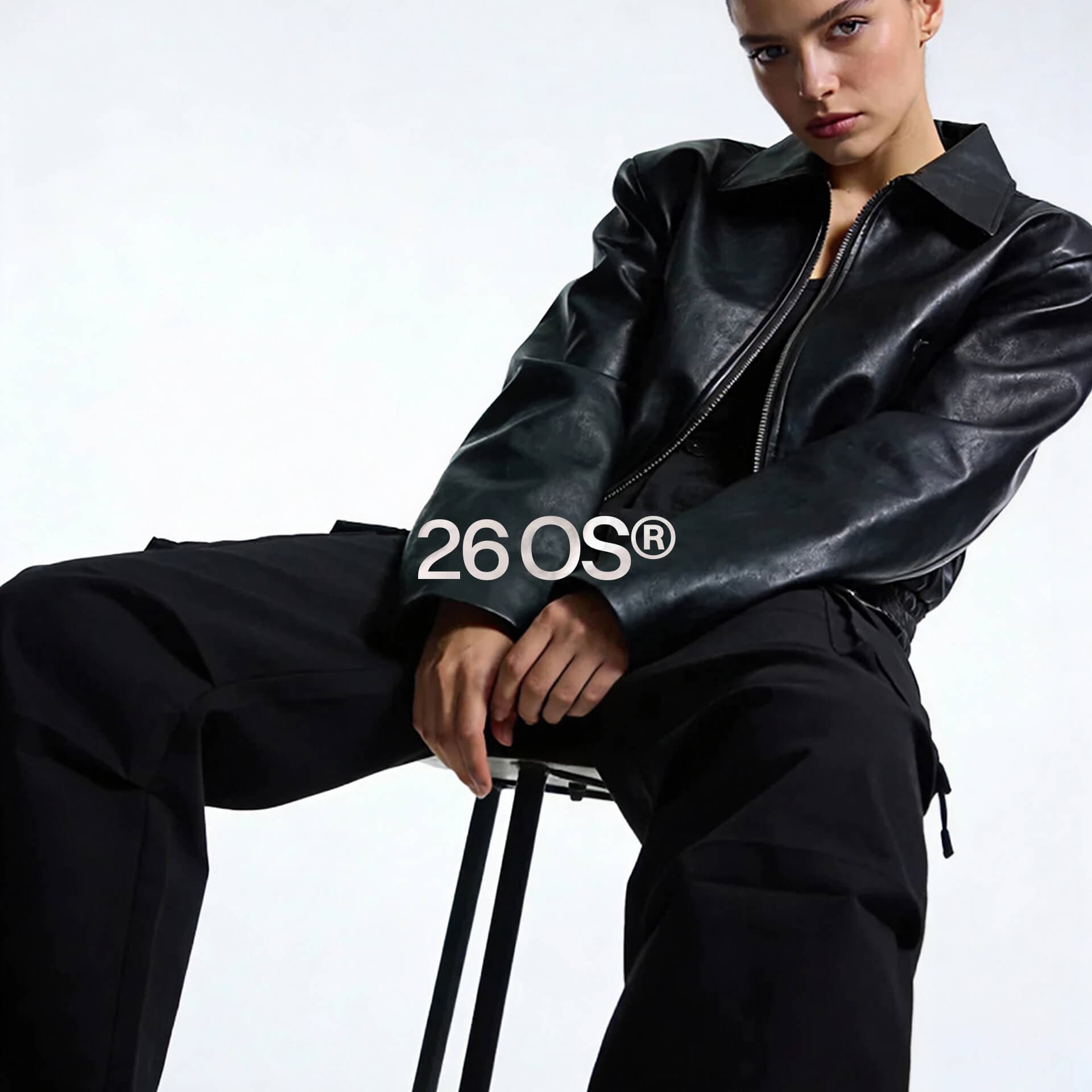
Soft colours and carefully arranged text give the packaging a quiet confidence. You can see at a glance which product you are holding. The same choices carry through to the website and the shop, so a small bottle and a full product page clearly belong to the same brand.

With Method, we wanted to see how much character a brand could have when we left more out. The result is a skincare concept that feels considered and easy to understand, with enough personality to remain recognisable.
More work

House of Founders · House of Founders

Attent · Attent